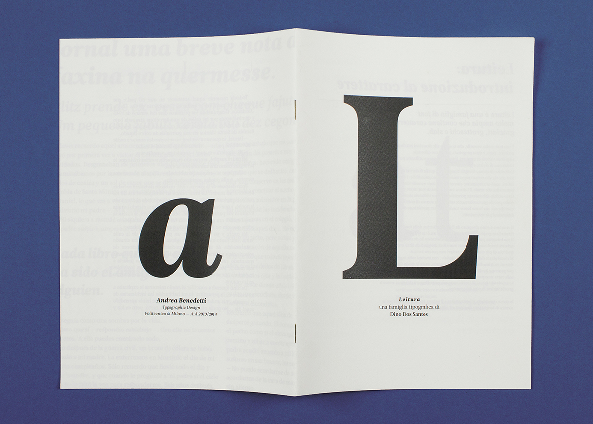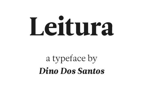
Leitura was designed by Dino Dos Santos, from DSType.
The aim of this project was to explore this typeface in every way, to explore its shapes and its possible uses, from magazines to books.
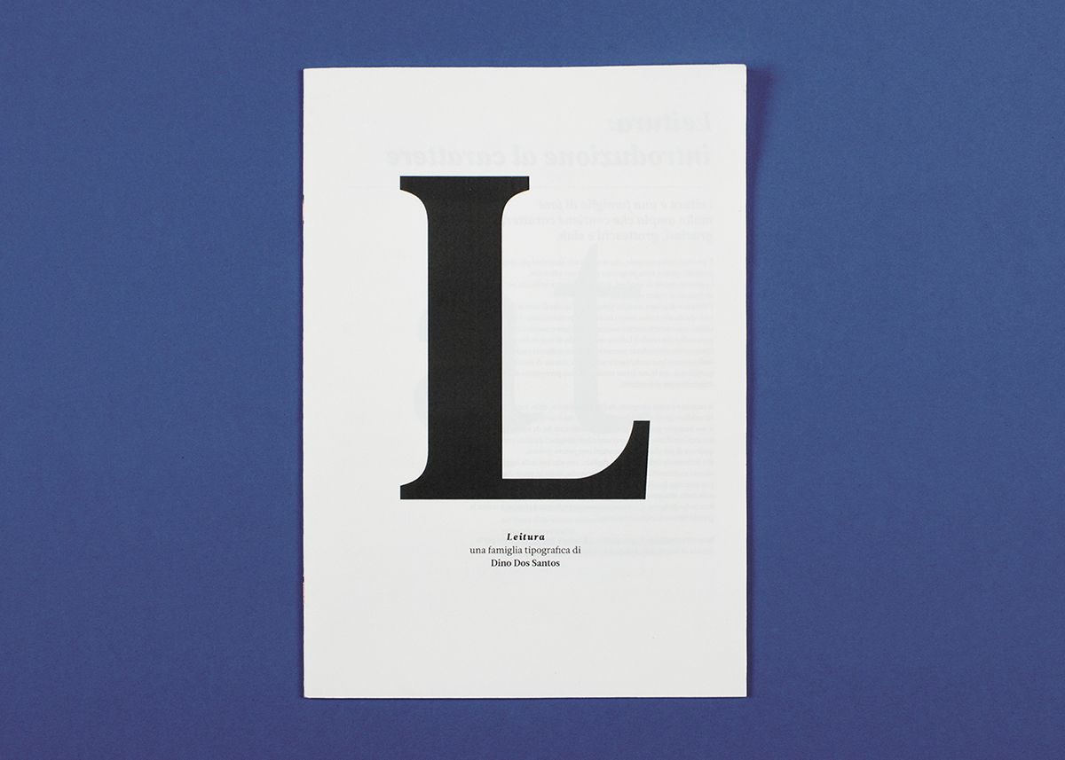
Cover. The font is illustrated with the capital L, first letter of the name "Leitura".

Introduction. The theme that accompanies all the brochure is big and small: the font is legible at very small sizes, but its shapes are peculiar and beautiful even when it's used at big sizes.

Size. An example of how the font and its weights work at different scales.

Use cases. From magazines to books, Leitura is a versatile font that can be used in different occasions.